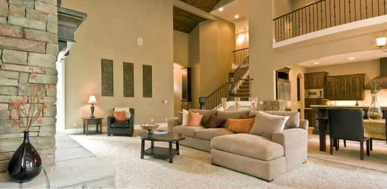
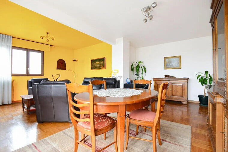
Bright Yellow
This color may be cheerful, but it should never be used for painting a whole room. Designers claim that using a vivid, rich yellow on every wall not only cheapens the room but also negatively stimulates the emotions. You might feel anxious, apprehensive, or over-excited as a result.
Turquoise
One paint color that can make your house look cheap is turquoise. It may look perfect in beach houses, but it can be too much for regular homes. According to designers, turquoise shouldn't be used to paint a whole room since it can appear too harsh.
Metallics
Silver, gold, or bronze accent walls are still quite common. However, designers describe these hues as "bright metallics," saying they are suitable for clubs but not for households. Choose shiny wallpaper or exquisite metallic artwork if you want to add some glitz to your room.
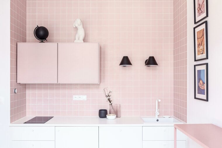
Beige With Pink Undertones
Many homeowners think adding a beige with a pink undertone will warm up the space, but designers say that this color clashes with most decor styles and will look out of place in a normal household.
Peach Fuzz
Peach Fuzz may look nice when applied properly as a paint color. However, according to designers, this is a picky color in general. They say that choosing a peach paint shade that isn't too pink or orange can be challenging. The bottom line? If you don't have a reliable designer to help you choose a color for the entire room, you might want to skip this one.
Tuscan Yellow
Tuscan yellow is a darker, warmer yellow that gained popularity in the 1990s and 2000s. In an Italian home, the dusty shade would be gorgeous, but in other places, it might seem a little too dramatic and out of style. Choose more forgiving colors like ochre or buttercup if you want to use yellow in your design, and always keep the natural light in your space in mind.
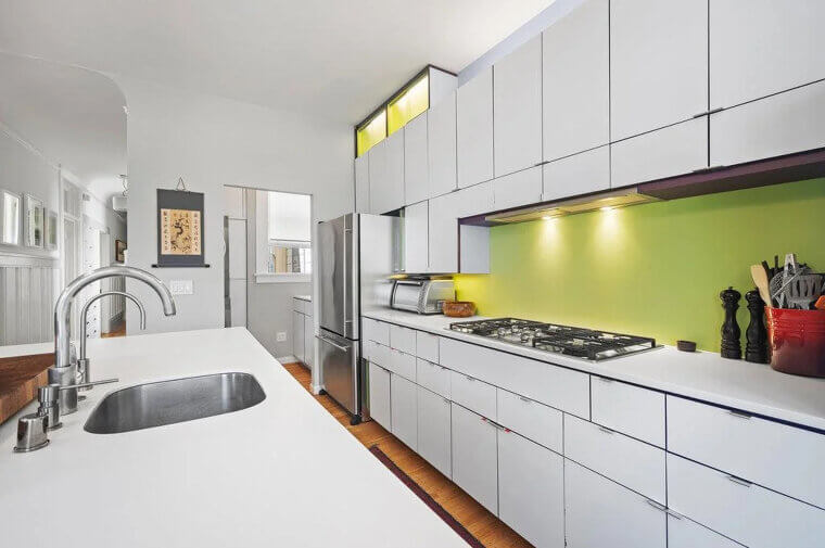
Mint Green
One color that might make a room appear cheesy is mint green. It can look great at first, but, depending on the lighting, this color can appear to look different. Choose a rich-toned blue or green paint color instead, which has been endorsed by designers.
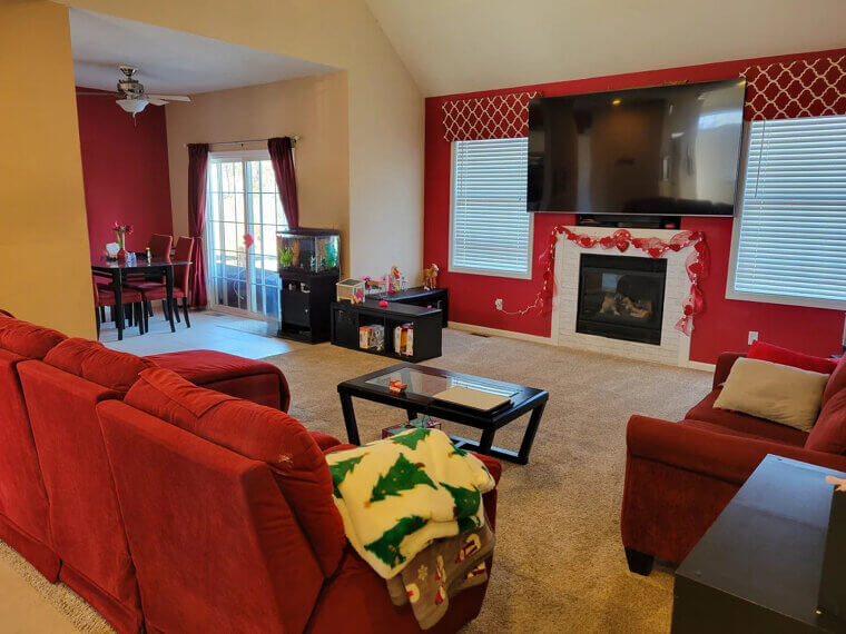
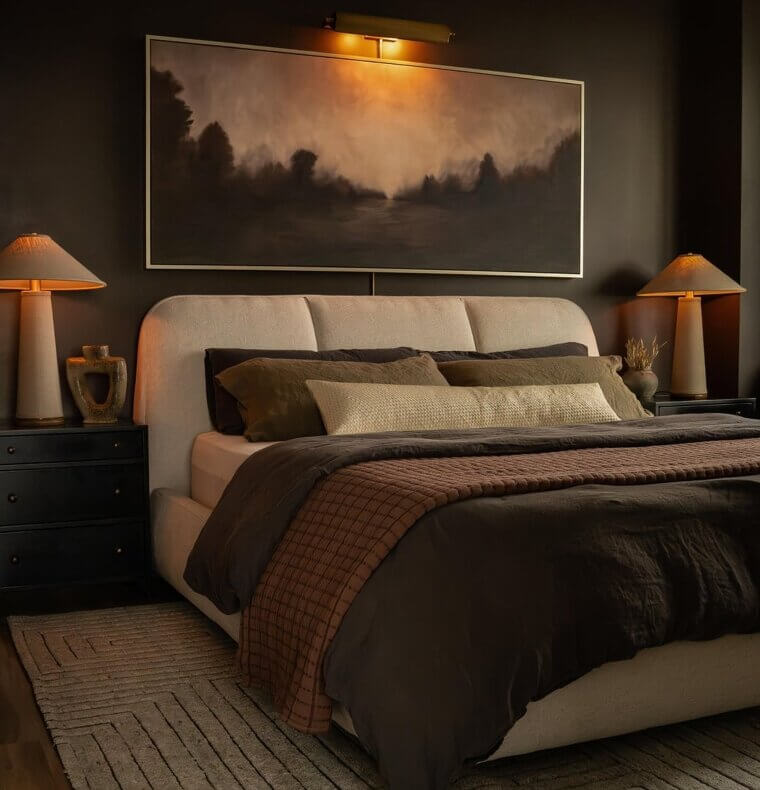
Dark Brown
Dark brown paint was popular in the 1990s and 2000s, but according to designers, picking an old-fashioned shade of brown paint can quickly make a space appear dreary, muddy, or even cheap. Choose a high-gloss finish if you're determined to go chocolate brown.
Baby Blue
Unless it's a traditional navy, it can be difficult to deal with blues, especially baby blue. Blue hues can be challenging, and if you don't pick the right shade, it may end up appearing like a cheap nursery, which isn't ideal unless that is what you're aiming for.
Light Gray
Light gray is the worst color for rapidly depressing a room's mood and giving it a cheaper appearance. Choose a different shade of gray or a neutral paint color instead, which will liven up your room while maintaining its blank canvas effect.
Moss Green
Green is often a calming color; however, stay away from moss or sage green hues. Similar to brown hues, these earthier, darker tones can give a room an excessively dismal and "dirty" vibe. It might also give the impression that a room is much smaller than it actually is.
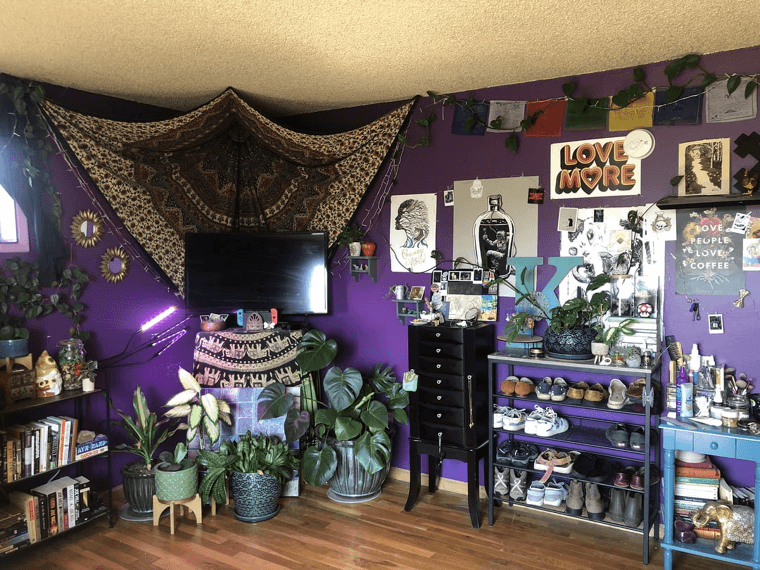
Deep Purple
Designers say that deep purple can ruin the aesthetic appeal of a house when applied excessively. Spaces are frequently overpowered by this deep tint, which makes them feel oppressive and heavy. Its audacity may cause an imbalance when combined with other design components.
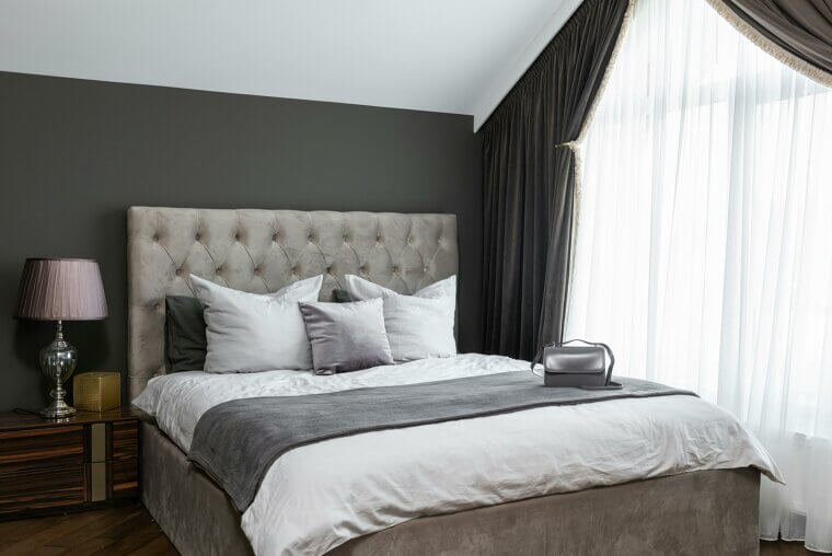
Dark Gray
Shades of gray were popular in many homes at one point. However, experts advise against utilizing these tones anymore, especially when decorating bedrooms and kitchens. Dark gray hues might exacerbate sadness by invoking emotions of isolation and loneliness. With this, gray has the tendency to make a look unloved and cheap.
Eggshell
Although some people like the neutrality of eggshell or off-white walls, this color can give the impression that a space is flat or lifeless. This is mostly because it frequently has a yellow undertone and lacks the vividness of dazzling whites. A room's lighting can also make off-white hues appear drab and inexpensive.
Pure White
Although "pure white" may seem timeless, using it excessively can unintentionally devalue a home's appeal. Too much white frequently results in a chilly, impersonal space devoid of personality and warmth. It runs the risk of looking like hospital décor or incomplete drywall in the absence of contrasting textures or features.
Red
Bright colors are never recommended as a paint color by designers. Red is a particular no-go. Despite their beauty, bright colors are not ideal for a living space where you want to feel calm and relaxed. With this, red can make a room appear dark and dreary.
Black
Black can be a useful accent color, but it must be used alone or in combination with other colors. Black isn't the best color for bedrooms, though, because of the intensity it brings to a space. Although some may prefer darker hues in the bedrooms, an all-black space makes the room appear sad, and when used excessively, even cheap.
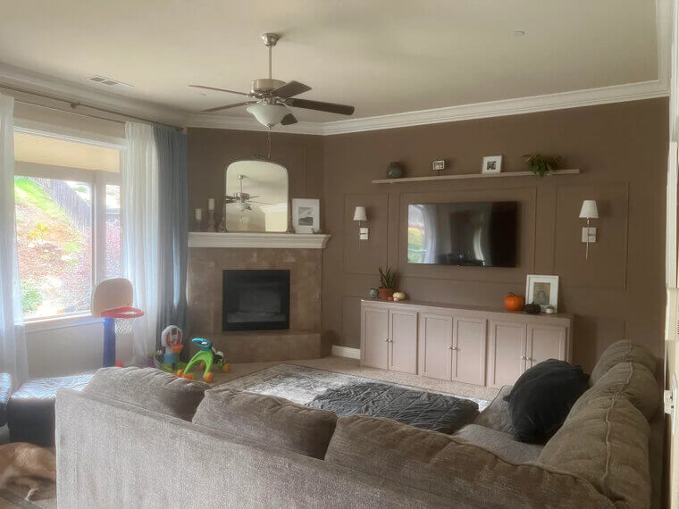
Builder’s Beige
The neutral color "builder's beige," which is frequently used in new construction, gives a house a boring, uninspired vibe. This generic beige lacks warmth and personality and is frequently utilized as a cost-cutting measure. Because of its flat, generic appearance, spaces may appear boring and unwelcoming.
Burnt Umber
Burnt umber, a rich, earthy brown, can feel antiquated and heavy when used incorrectly. Its strong tone frequently leaves rooms feeling dreary because it lacks the warmth or vitality necessary to brighten a space. It can be used as an accent or combined with lighter, complementary colors to create a more welcoming and well-balanced space.
Lime Green
Different shades of green can be used throughout a home's interior, but lime green is typically too intense for any home space. With this, lime green is often seen as a cheap color, according to designers. A dark green wall makes a bold statement, but lime green retains too much light, giving it a bright reflection that might not be the best choice.
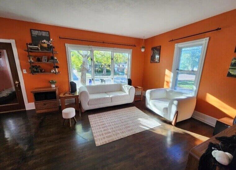
Orange
When utilized excessively, orange can overrun a room despite being lively and energizing. This striking hue frequently produces a startling impression, making spaces appear cramped and unduly dramatic. Its strong tones can disrupt relaxation in your home, particularly in cramped areas. Instead, use a delicate peach color as a substitute.
Peach
Peach tones are most common in older homes, so using this color can make your home appear not only old, but also cheap. As a subtle accent, peach fuzz looks good, but if it takes up a complete wall, it can easily make the space feel dark.
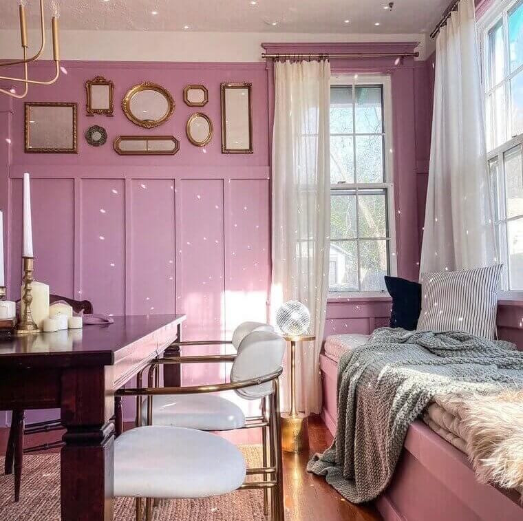
Pink
Pink is a hit-or-miss color. Homes with a "pink room" can accommodate the unique preferences of their residents. However, when it's not used right, this color can make your home look childish and cheap.
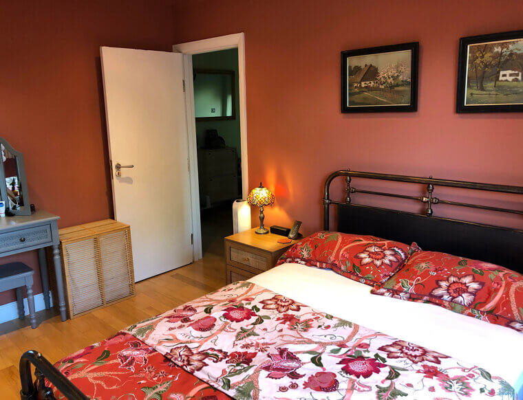
Terracotta
While some individuals find a subtle shade of terracotta on a living room wall to be very appealing, others find it to be as unsettling as bright red kitchen walls or an orange bedroom. With this, terracotta was the height of fashion in the 1960s, so stay away from this color if you prefer a richer, modern look.
Opaque Couche
Opaque couché can give a house a lifeless, drab appearance. This dull, muddy brown tone is devoid of warmth and vitality, which results in a stifling atmosphere. Because of its unattractive tone, spaces may appear outdated or messy. Choosing richer or more vibrant colors can significantly enhance appearance.
Harsh Coral
With its excessively vivid and powerful hues, harsh coral may overpower a space and create a chaotic atmosphere. This striking color lacks adaptability and frequently clashes with other hues, creating a crowded look. A more welcoming and peaceful ambiance can be achieved by choosing muted colors or softer coral shades.
Flat Pastel Yellow
Even while flat pastel yellow is gentle and muted, it can inadvertently leave a house feeling uninspired and washed out. Its subdued tone frequently lacks the warmth or vitality required to enliven a room, giving it a lifeless or faded appearance.
Oversaturated Lavender
Although striking, too much lavender can overpower a space and detract from its overall beauty. This very striking tint can give off an unnatural or gaudy vibe and frequently clashes with other design components. However, a more refined and well-balanced atmosphere can be produced by combining this color with complementary accessories.
Faded Olive
According to designers, faded olive is a subdued shade of green, faded olive, and can make spaces seem drab and cheap. Its muted tone frequently lacks depth and vigor, giving it an outdated or lifeless appearance. A room can be revitalized and given visual interest by adding colorful accents or combining them with richer, complementary colors.
Washed-Up Salmon
Spaces that have washed-up salmon, a faded and unattractive pinkish-orange hue, can make your room feel more antique rather than modern. Because of its subdued tone, it makes spaces appear dull and unimpressive. A more stylish and welcoming ambiance can be created by bringing in newer shades to revitalize the atmosphere.